Aston Martin font
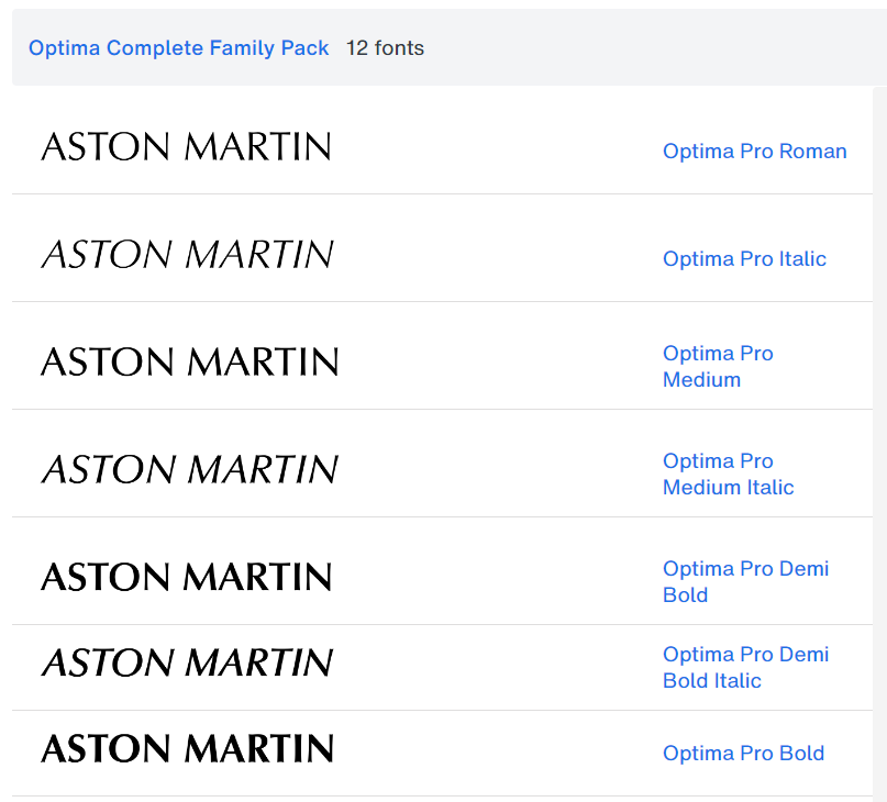
The Aston Martin font that is used in the official logo for this classic British sportscar manufacturer is a stylish sans-serif typeface by the name of Optima Pro Roman. It is a professional font that was designed and created by a font designer known as Hermann Zapf all the way back in 1958.
There are a total of 12 fonts which form the Optima Complete Family Pack. There is a total of 416 glyphs included in this form family. Some of the fonts which are included are:
- Optima Pro Roman
- Optima Pro Italic
- Optima Pro Medium
Other variants in this family include: Italic, Bold, and Black. Here is a preview of what this Aston Martin replica font looks like:
Aston Martin branding and typography
Aston Martin is a luxury sports car brand, known for their fast cars and beautiful car models which use the golden ratio as a principle in their design philosophy. Aston Martin was established in 1913 London, and after just two years they would release their first ever car under the Aston Martin name. The company would continue to engineer and design cars until eventually the company met the golden boy that put the brand in the spotlight: James Bond. Being as suave as Mr. Bond is, it gave the Aston Martin a special sense of elegance and style that would stay with the company moving onwards.
Font used in the official Aston Martin logo
The Aston Martin logo sports a sleek and elegant design most commonly attributed to luxury brands and art deco. The most iconic element to Aston Martin’s logo are the wings, meant to symbolize both speed, freedom, and elegance. The wings themselves are also designed beautifully, maintaining symmetry all throughout. The font used in the title is just as sleek as the wings itself, mixing lines of different thickness for the letters that serve to emphasize their shapes. Although absent in car emblems and other branding, Aston Martin uses a color palette of silver and green to give the logo an extra sense of elegance and regality.
Categories: Professional , Transport Fonts