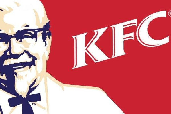
KFC font

The KFC font used in the official logo for the famous fried chicken fast food restaurants is a serif typeface by the name of Friz Quadrata. It was designed and created by multiple font authors including Victor Caruso, Ernst Friz, and Thierry Puyfoulhoux.
About the KFC brand
Kentucky Fried Chicken, more famously known by its abbreviation KFC, is a fast-food restaurant chain in the United States that takes pride in its delicious and crunchy fried chicken. With more than 25,000 locations across 150 countries (including 753 KFC stores in Australia alone, as at last count in 2023), it is the second-largest fast-food restaurant chain behind McDonald’s as of December 2021. Its headquarters are in Louisville, Kentucky. Colonel Harland Sanders (1890-1980) established KFC in Corbin, Kentucky, after trying his luck selling fried chicken out of a roadside restaurant during the Great Recession. In 1952, Sanders recognized the potential of restaurant franchising and managed to open the very first KFC franchise in Utah. Yum! Brands, which also operates the Pizza Hut and Taco Bell franchises, currently manages the chain.
KFC Logo Font
A cheerful Colonel Sanders wears a bright red chef apron over a red background in the KFC logo. Furthermore, thick lines define his visual expression, creating the impression that he is gazing at you, something that initially attracted people’s attention. Instead of just Kentucky Fried Chicken’s full title, the restaurant’s name is abbreviated to the letters KFC beneath the Colonel’s portrait. The text is typeset in a slightly tweaked version of Friz Quandrata. The dynamic red color in the logo makes the Colonel’s face more enticing to customers.
Categories: Food & Drink Fonts , Professional