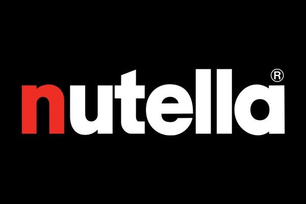
Nutella font

The Nutella font used in the official logo for the famous Italian hazelnut and cocoa spread is a sans-serif typeface by the name of ITC Avant Garde. It was designed and created by a team of font authors which included: Edward Benguiat, Herb Lubalin, Christian Mengelt, Erich Gschwind, Tom Carnase, and André Gürtler. Since then it has been published via the ITC font foundry.
About the Nutella brand
Everyone’s favorite chocolate hazelnut spread! Nutella was first established in 1965 Germany, but its roots go further back in history. When the war ended in 1945 there was a scarcity of cocoa, and this is where Ferrero stepped in. In 1946, Ferrero created the precursor of Nutella’s recipe using hazelnuts, sugar, and only a tiny amount of the scarce cocoa. The initial recipe by the name of Giandujot was a far cry from the Nutella that we know today, but years of research and development have led to the spreadable gold that we have today. Creamy, sweet, and just the right amount of nuttiness is enough to make anyone nuts over Nutella.
Nutella Logo Font
Nutella’s logo uses ITC Avant Garde, a sans serif font originally found in Herb Lubalin’s 1968 Avant Garde magazine as an uppercase-only font. The font was further improved with the help of Tom Carnase in 1970 resulting in the font that we see today. Based on Lubalin’s logo for Avant Garde magazine, this font was originally all uppercase which made it very popular for advertisers in the ‘70s. Instead of the widely used uppercase version of the font, Nutella instead opted to use lowercase lettering only, which gives the logo a slight gentleness without sacrificing the eye-catching aspect of the font. The font itself uses a mix of curves and corners, emphasizing the lines in letters. The logo uses red, white, and black as its main colorways, interchanging depending on the background but constantly leaving the “n” as its own unique color.
Categories: Food & Drink Fonts , Professional