Scorpions font
The name of the Scorpions font which looks the most like the lettering used on their album cover, is a typeface by the name of Lady Starlight. This is a 70’s vintage inspired font created by Raymond Larabie and released via his Typodermic Fonts design studio.
Scorpions, like most other bands, have their own font. The Scorpion font has a SCI-Fi vibe to it. It’s all in capital letters and it’s all very warped, with letters seemingly bulging around the edges and sides. It’s a font that is recognized by millions worldwide. As for the band, there is quite a lot of controversy surrounding their lack of major awards, considering how big of an influence the band has had on the music industry. Although they do have some awards, like Echo awards and a couple of World Music Awards, there are many fans out there who believe that this band should be inducted into the music hall of fame.
About the Scorpions typeface
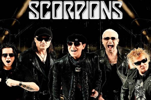
Scorpions are a rock band that formed in Hanover, Germany in 1965. Bandmates Rudolf Schenker, Klaus Meine, Matthias Jabs, Pawel Maciwoda, and Mikkey Dee have captivated audiences all over the world. Having released major songs such as Send Me an Angel, Wind of Change, and Rock You Like A Hurricane, they have become a major part of popular culture. Even today, more than half a century later the band is still going, playing for fans all over the world. Scorpions have sold an estimated 100 million records worldwide with that number still climbing today.
Scorpions font generator
Use our free Scorpions font generator tool below to create your own custom design logo or image. Enter your text, select a font, choose a font size, and pick your favorite colors. Hit the Generate button and your logo/image is created and ready to download.
Categories: Music Fonts