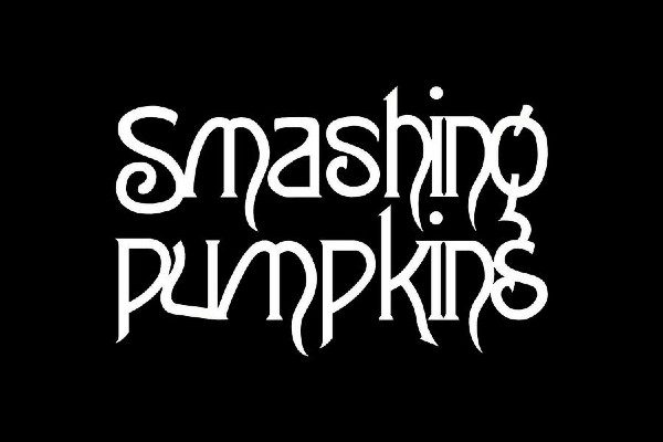
Smashing Pumpkins font

The name of the Smashing Pumpkins font that is most similar to the one that is used in the lettering on the cover of their latest studio album, is a typeface by the name of Burton’s Nightmare.
This gothic styled font comes with a Freeward font license, which means that it can be freely used for all personal uses – including web design, posters, and school projects.
The Smashing Pumpkins font is quite similar to what you’d expect when seeing writing from the 1600s. This medieval-style typeface is very eye-catching with lines straying off in different directions and letters that seem to curve inwards, it fits in well with the band’s overall theme. As for the Smashing Pumpkins, the band has one a whole host of awards over the years including MTV video music awards and two Grammys. This post-punk rock band is still popular today with hardcore fans located in almost every country around the world, and since they are still playing today, there’s a good chance that we may hear more from them in the near future.
About the Smashing Pumpkins typeface
The Smashing Pumpkins are an alternative rock band that originated in Chicago in 1988. Famous for songs like Set the Ray to Jerry, Ava Adore, and Muzzle. They have sold more than 30 million albums worldwide. This critically acclaimed band has graced the covers of magazines such as Kerrang! And Rolling Stone. The Smashing Pumpkins have performed for audiences all over the world. The Smashing Pumpkins split up in the year 2000. However, they got back together in 2006, and after a few band member changes the group is still going to this day.
Smashing Pumpkins font generator
Use our free Smashing Pumpkins font generator tool below to create your own custom design logo or image. Enter your text, select a font, choose a font size, and pick your favorite colors. Hit the Generate button and your logo/image is created and ready to download.
Categories: Music Fonts